Product Polish Sprint · 1 week
What one focused week can change.
We took one critical B2B workflow and redesigned it around the decision the operator actually needs to make.
- Duration
- 5 days
- Scope
- 1 critical workflow
- Deliverables
- UX audit + redesign + prototype
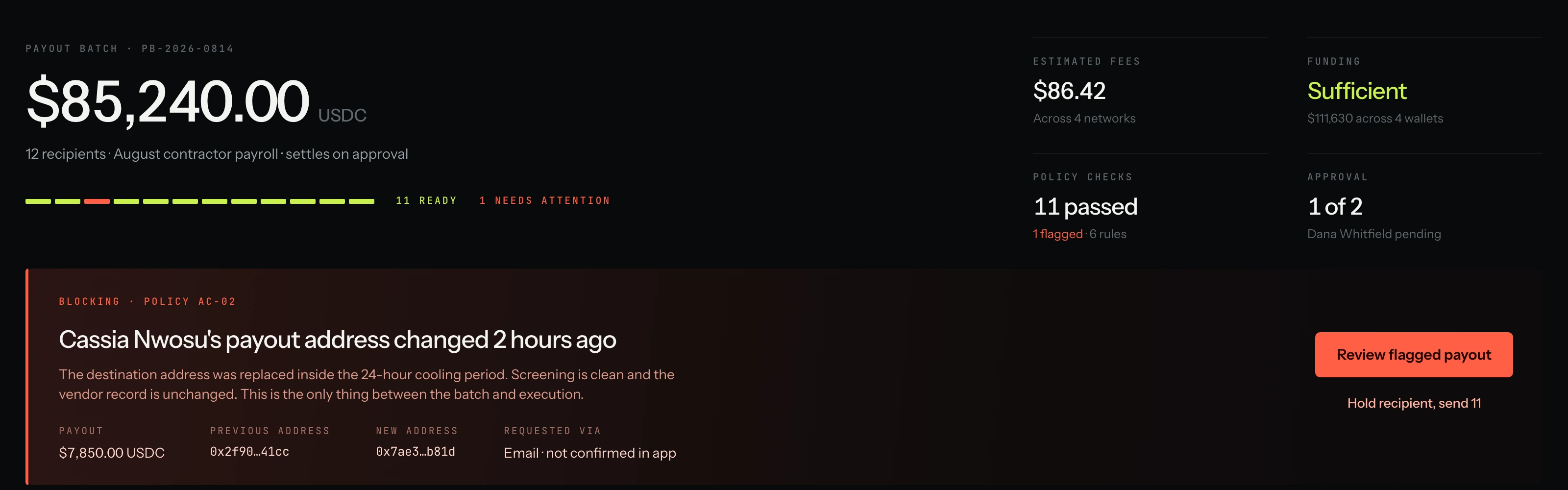
The workflow: a finance operator approving a $85,240 USDC contractor payout across four wallets and four networks. The product is Solvent, a treasury and payment operations platform we built to demonstrate the Sprint. The constraints, controls and failure modes are modelled on real ones. The company is not.
01 · Starting point
Everything was there. The decision wasn't.
This is not a rescue job. The existing screen is competent: the data is complete, the tables are correct, every state the workflow can reach is represented somewhere on the page.
The problem is that all of it sits at the same level. Twelve payouts, four wallets, four networks, six policies and two approvers, each in their own panel, each equally loud.
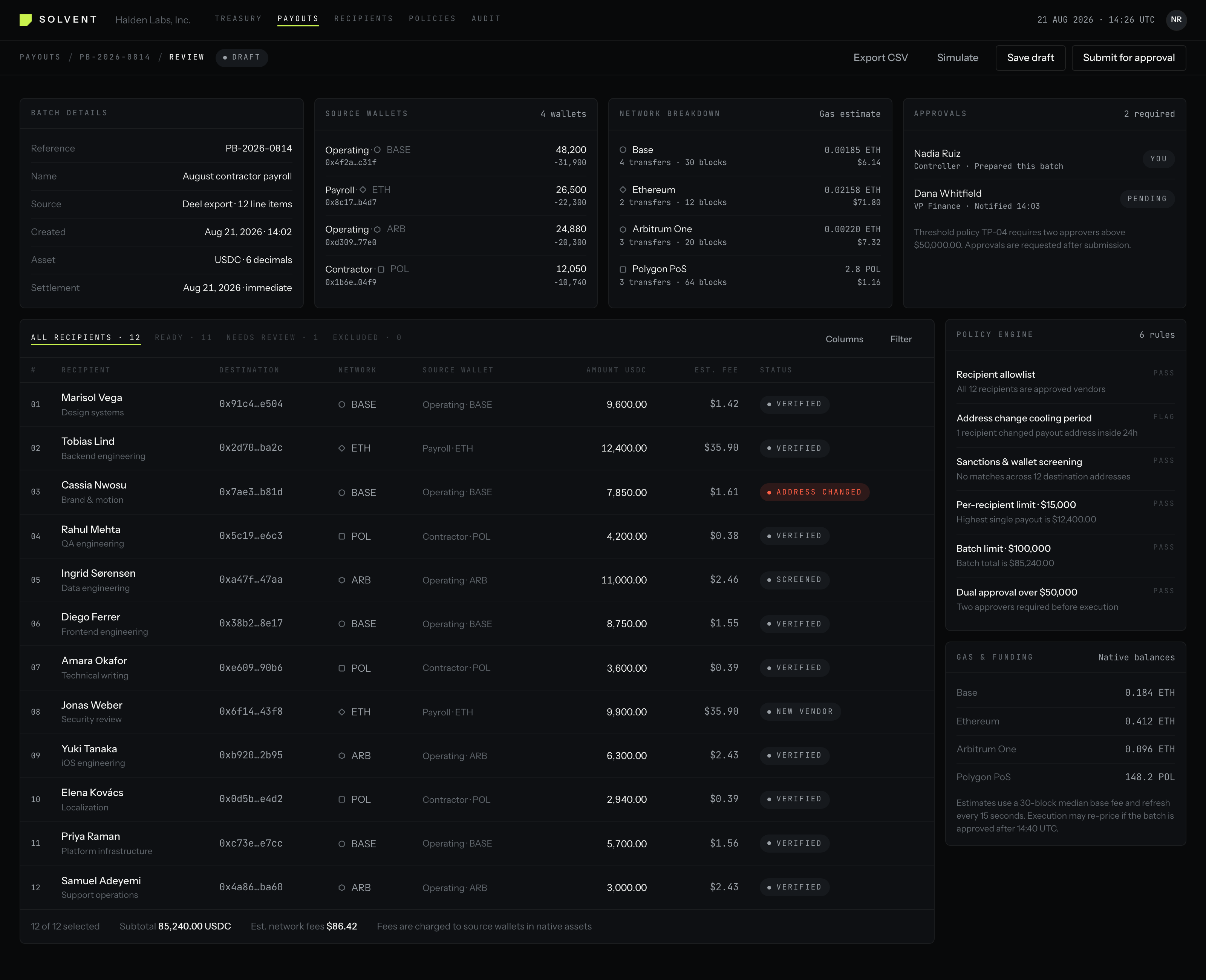
What the audit found
- 01
Readiness was assembled by the operator, not the product
Funding sat in one panel, policy results in another, approvals in a third, per-recipient status in a fourth. Nothing on the screen said whether the batch was ready.
- 02
The blocking issue looked like every other state
One recipient had changed their payout address two hours earlier. It rendered as a chip the same size as Verified, in row three of twelve.
- 03
Total cost required mental arithmetic
Gas was estimated per network, in native assets and dollars, beside a table that carried a per-transfer fee column and a subtotal at the bottom.
- 04
Approval context lived apart from payout context
The threshold rule, the two approvers and their state were correct and complete. They were also on the far side of the screen from the thing being approved.
- 05
Blockchain detail outranked the decision
Wallet routing, network confirmations and address hashes held the top of the layout, where the amount and the exception should have been.
02 · Focus
We didn't redesign the platform.
We redesigned the decision.
A payout review has one job: get an operator to a defensible yes or a deliberate no. So we wrote down the questions they ask, in the order they ask them, and made the screen answer them in that order.
- 01Is the batch funded?
- 02Are the recipients valid?
- 03Did policy checks pass?
- 04What needs attention?
- 05What will this cost?
- 06Can I safely execute it?
03 · After
Complexity underneath. Clarity on top.
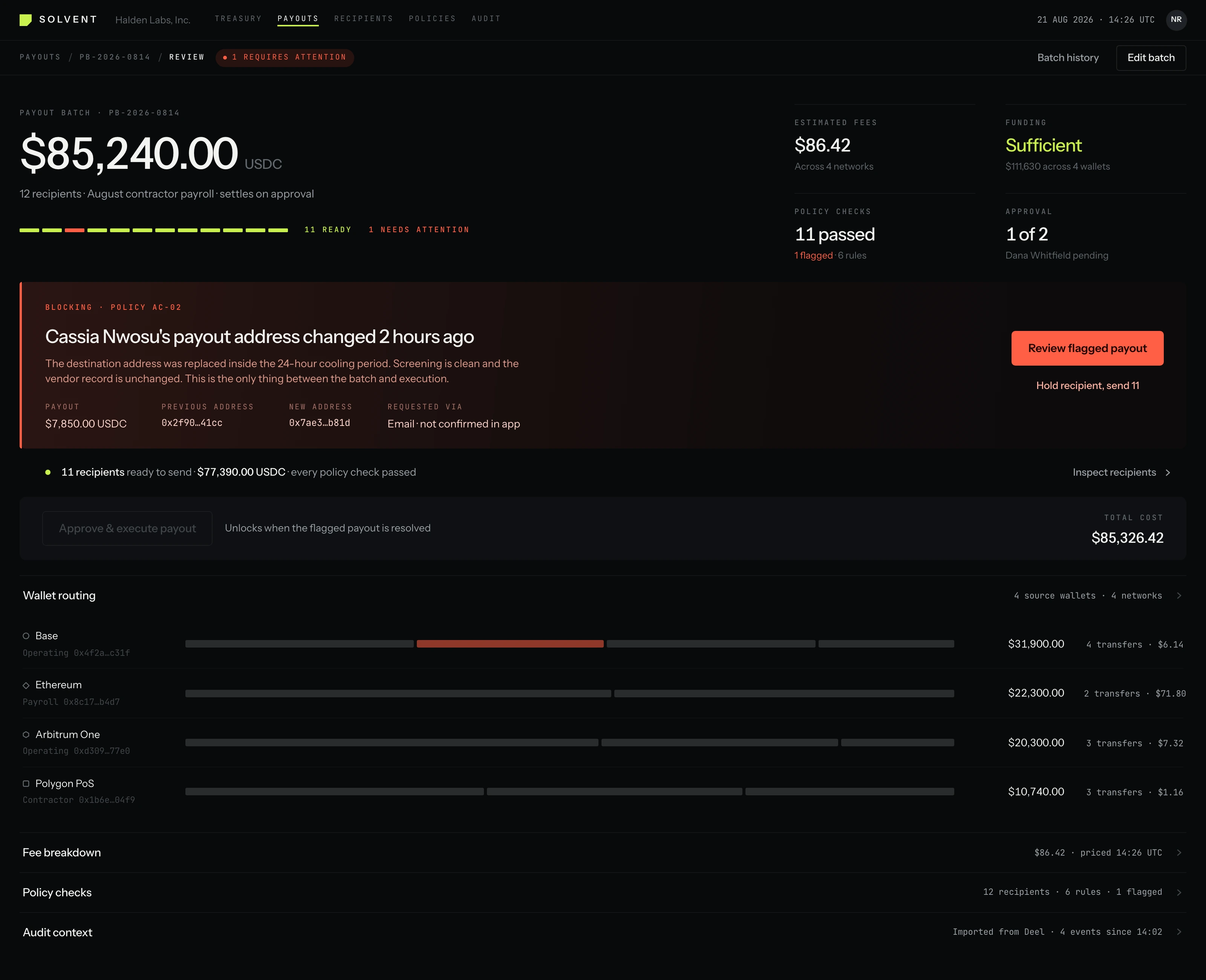
Nothing was removed. Wallet routing, network selection, gas estimates, transaction hashes and the full policy rule set are all still here, one level below the decision instead of beside it.
The primary action resolves the only thing standing between the batch and execution. The operator never has to inspect eleven healthy payouts to find the one that matters.
- Payout batch
- $85,240.00 USDC
- Recipients
- 11 ready · 1 flagged
- Estimated fees
- $86.42 · 4 networks
- Funding
- Sufficient
04 · Side by side
The same batch, twice.
Same data, same controls, same product. Only the order in which the screen answers the operator changed, and that is the whole argument for the week.
05 · Key changes
Four decisions did most of the work.
- Before
- Every recipient and transaction state competed for attention.
- After
- Exceptions are prioritised. Healthy transactions stay quiet.
- Before
- Fees were distributed across wallet and network detail.
- After
- One total execution cost, visible before anything else.
- Before
- Approval status lived separately from transaction readiness.
- After
- Operational and approval context share one decision view.
- Before
- The operator had to inspect all twelve payouts.
- After
- The product names the one payout that requires a human.
06 · The rest of the workflow
A decision has to survive the next four screens.
Clarity at the top of the review is worthless if the exception, the approval, the execution and the record fall apart behind it. The Sprint covers the workflow, not the screenshot.
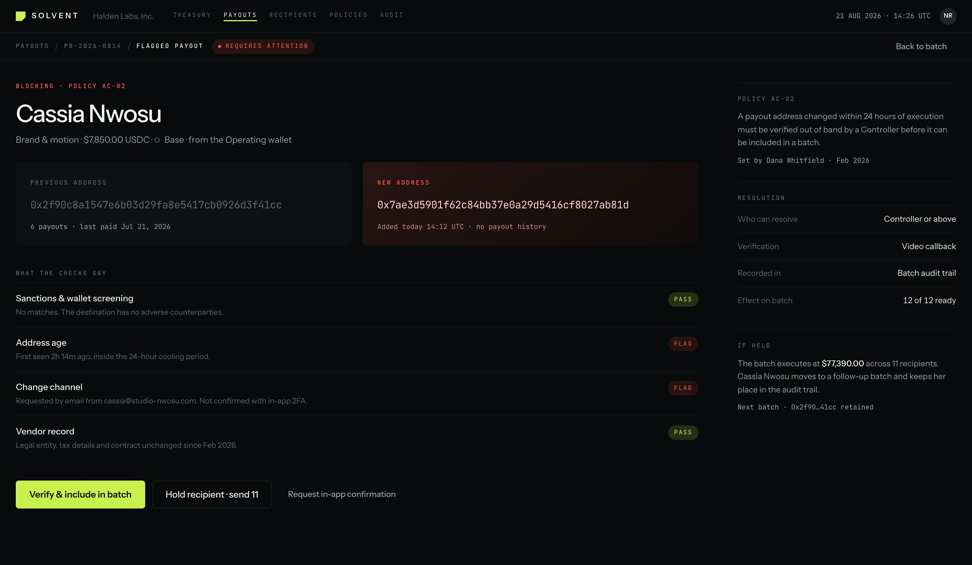
Flagged recipient
The exception opened on its own terms. The two addresses are set at the size of the decision they carry, with the checks that passed and the two that did not underneath.
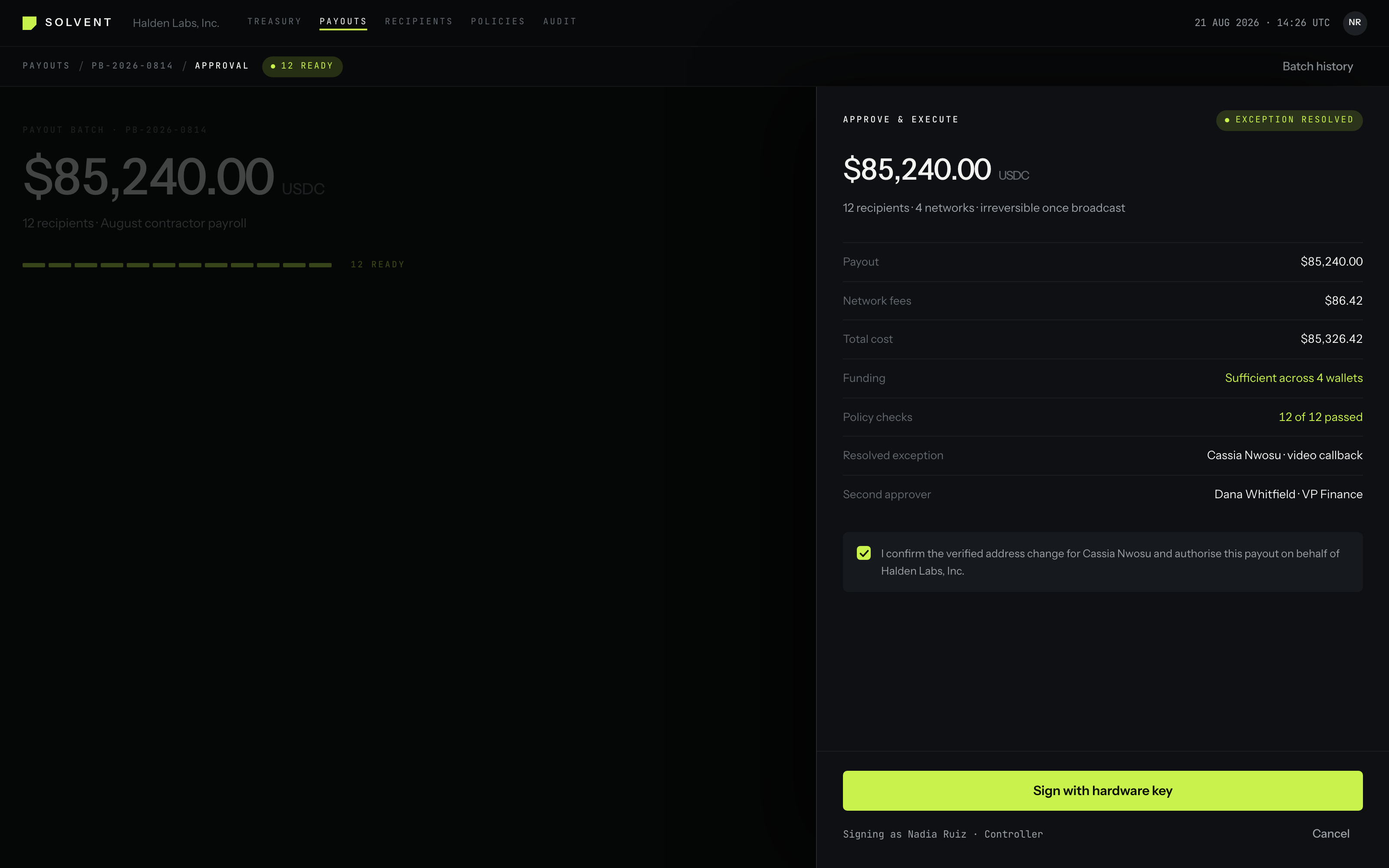
Approval
Signing arrives as a drawer over the batch rather than a modal in front of it, so the operator can still see what they are authorising while they authorise it.
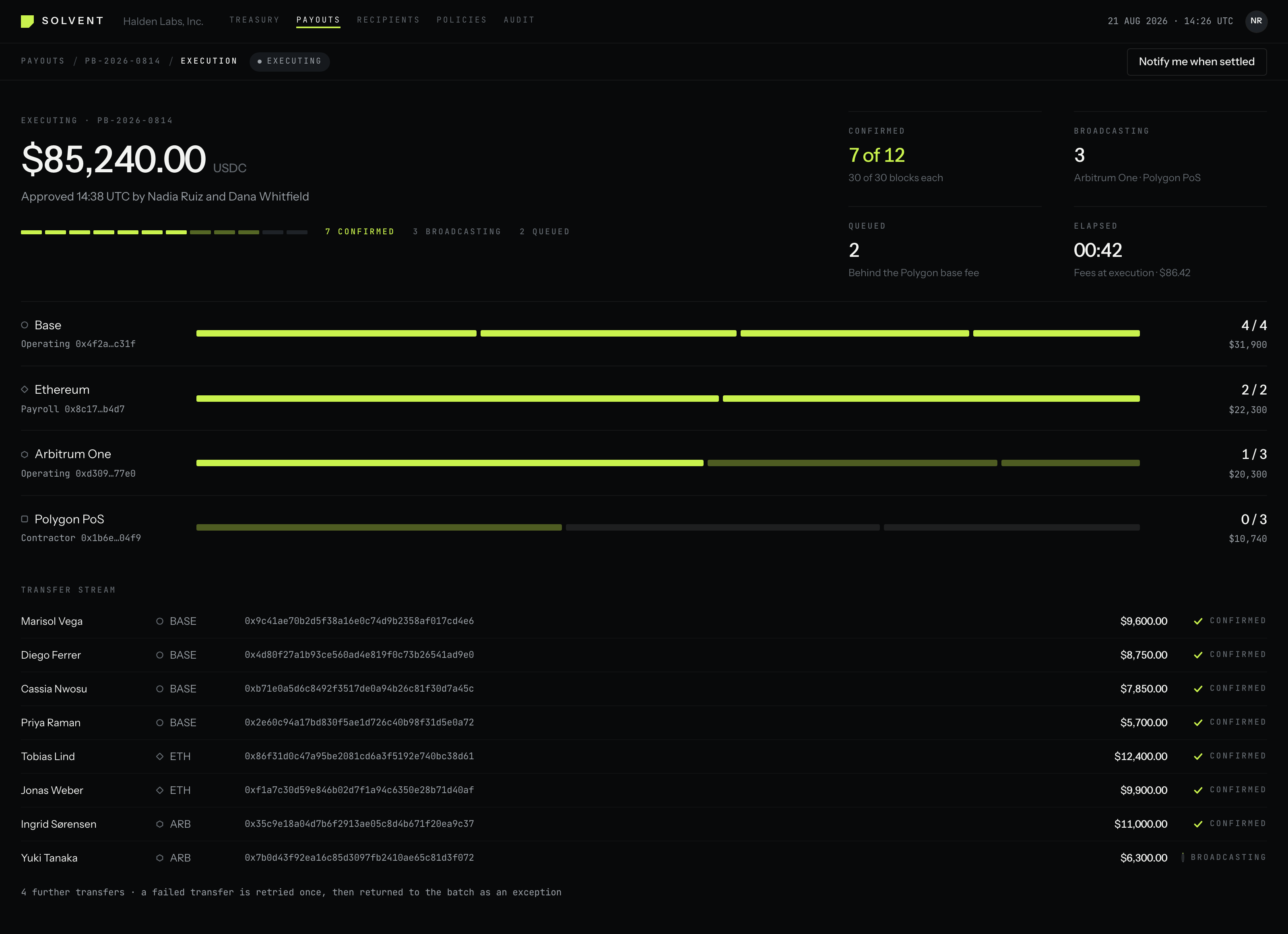
Executing
One lane per network, one segment per transfer. Execution reads as movement across four chains instead of a percentage, and the queued tail says what it is waiting on.
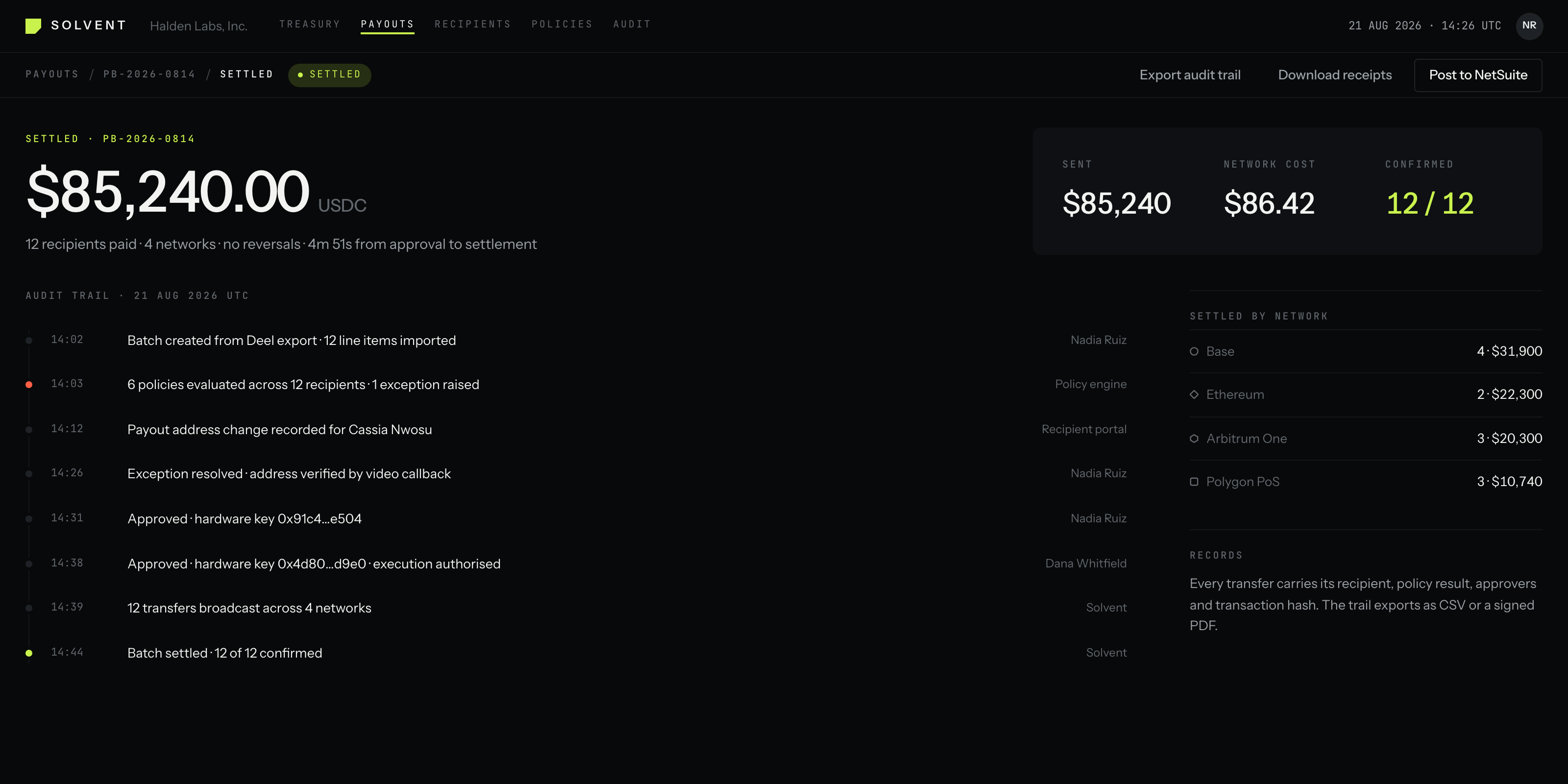
Settled
The trail an auditor reads six months later: import, policy result, resolved exception, both approvals, broadcast, settlement.
07 · Deliverables
What ships after one week.
- Focused UX audit
- One workflow, taken apart. What breaks the decision, and why.
- Prioritised product issues
- Ranked by what they cost you, not by how easy they are to fix.
- Redesigned critical workflow
- The information architecture and interaction model, resolved.
- High-fidelity UI
- Real states, real density, real data. Not a marketing mockup.
- Interactive prototype
- The workflow clickable end to end, including the exception path.
- Developer-ready handoff
- Specs, tokens, states and the reasoning behind each call.
One critical workflow. One focused week.
If part of your product makes users work harder than the problem requires, we'll find the friction and redesign it.
$3,000 · one-week sprint