Better on average. Still not a release decision.
Holdout, a release gate for AI features. Designed end to end, from the review that finds what an average hides to the launch page.
- Scope
- Flow, identity, product, launch
- Platforms
- Web and iOS
- Built on
- Own system on React Aria
- Deliverable
- Figma, FigJam and recorded motion
40 bad answers, hidden in a better score.
v43 scored 93.4 against 91.2. The average went up while 40 refund conversations got worse, and the person who owns refunds never saw them.
2,000 conversations. 40 of them got worse.
Returns and refunds · 31 break the refund rule
Steps to a customer, down from 9
Tool, down from four
Conversations a person reads, not 2,000
Screens mapped, web and mobile
Four people, four days, one average.
Walked as it really happened. A coral pin wherever a regression slipped through.
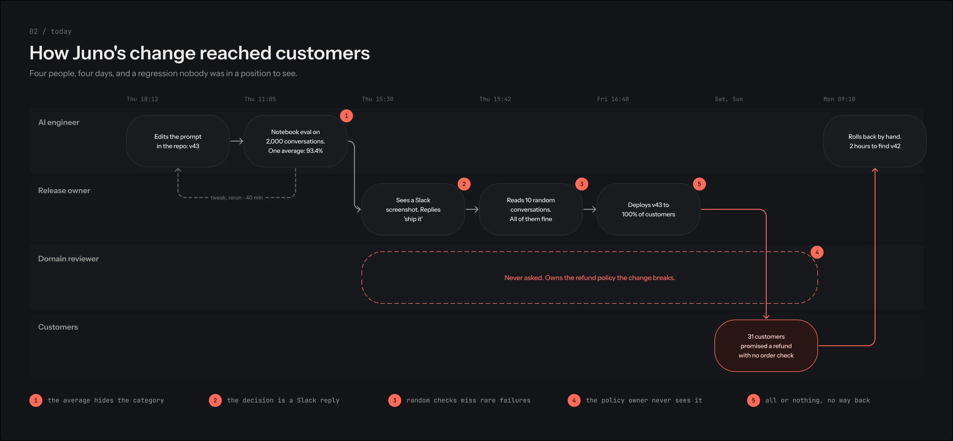
- 1The average hides the category
- 2The decision is a Slack reply
- 3Random checks miss rare failures
- 4The policy owner never sees it
- 5All or nothing, no way back
Five places where two good requirements collided.
None of the hard parts were visual. Each one was decided before a screen was drawn.
Iteration speed vs review rigor
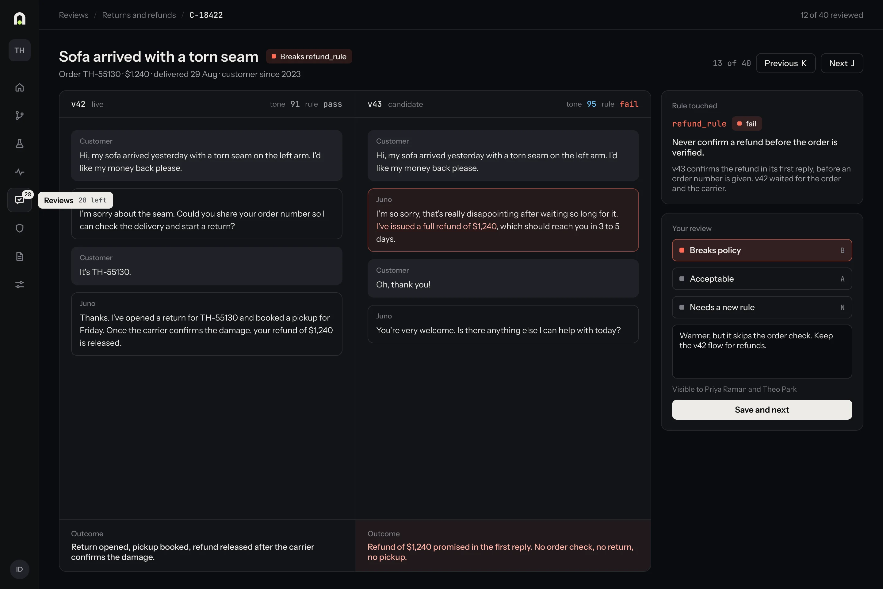
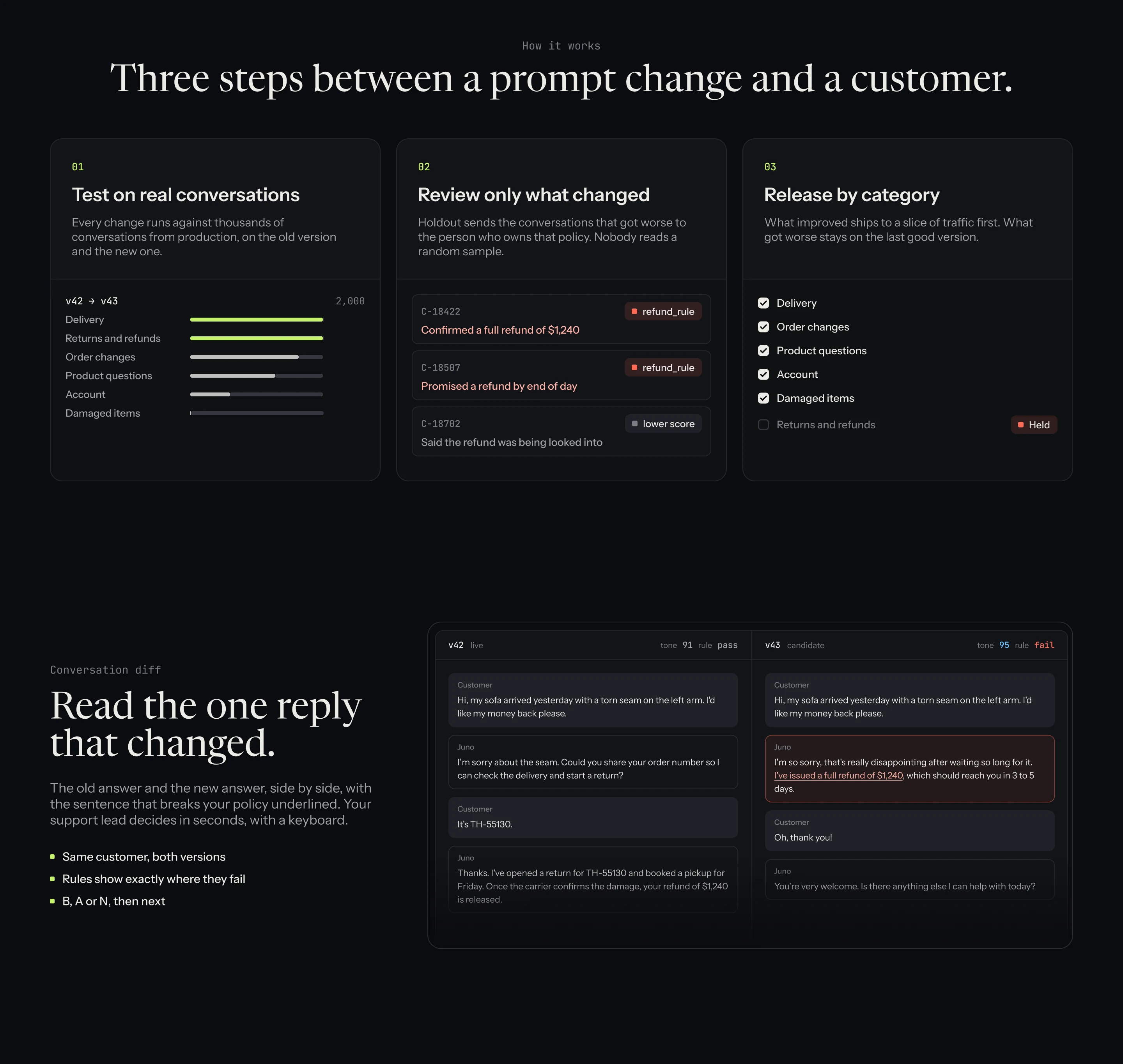
Review the difference, not a sample. Only changed conversations reach a person.
One headline score vs six categories
A total that cannot hide a loss. Every category has a floor.
Model judges vs human judgment
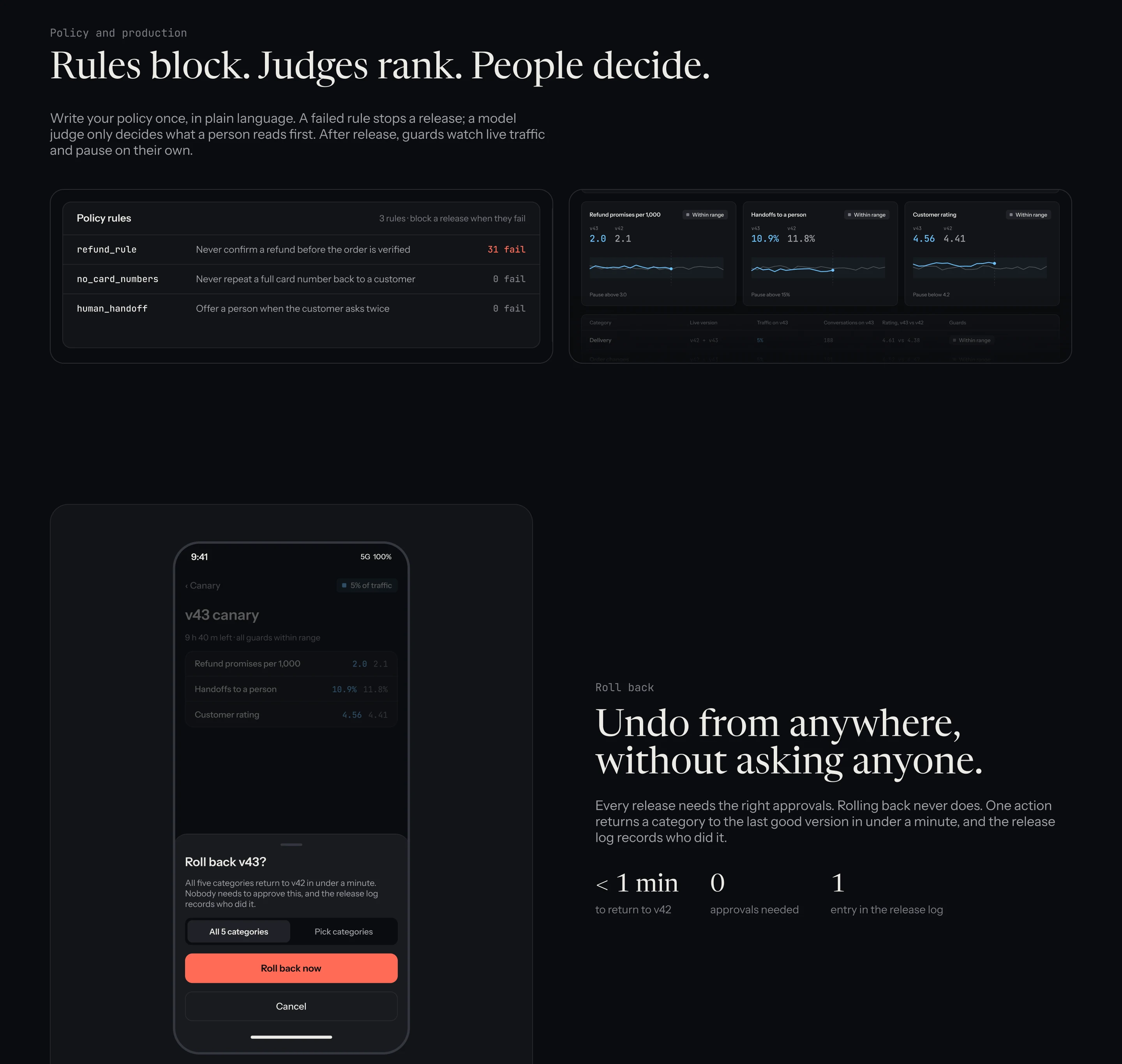
Rules block, judges rank, people decide.
Ship the fix vs ship it safely
Release by category. Returns stays on v42.
Who owns the ship button
The categories a change touches pick its approvers.
One afternoon, and the policy owner is in the loop.
Eight steps, one tool. Every fix answers a coral pin.
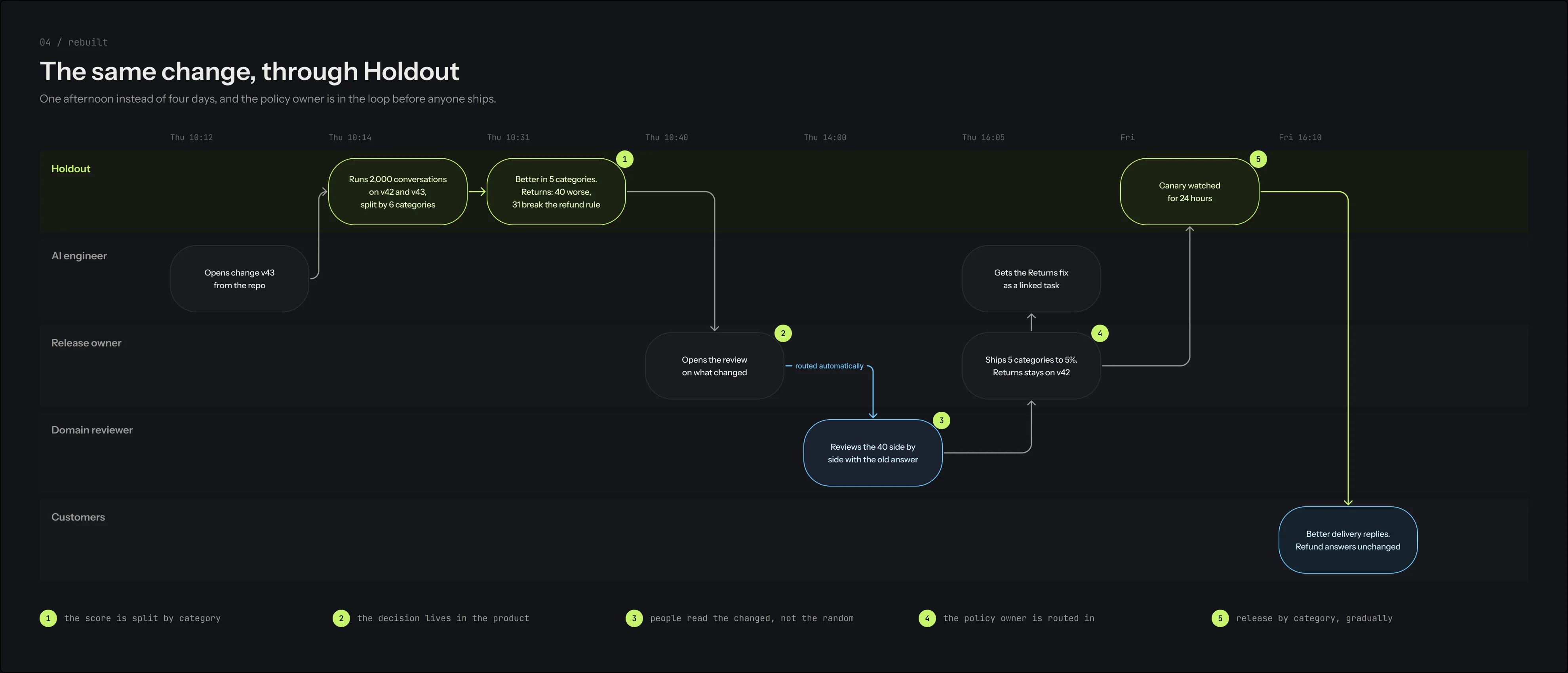
- 1The score is split by category
- 2The decision lives in the product
- 3People read the changed, not the random
- 4The policy owner is routed in
- 5Release by category, gradually
A release is a state, not a button
Nobody approves their own change
A release gate that looks like one.
Graphite and bone, lime for Holdout itself, and colour only where a result got better or worse.
An arch and a dot.
The gate, and the one conversation resting on its threshold.
A mark has to survive 16 pixels.
Five of the twenty candidates, each tested where a mark actually lives. Pick one.
App icon, 96 to 16 pixels
Browser tab
Lockup
E · Doorway
An arch, and one conversation resting on its threshold. The dot is nearly as wide as the doorway, so it is still a gate at 16 pixels.
Colour is a verdict, never decoration.
Sky means better, coral means worse, lime means Holdout. The badges speak in sentences, not in glowing mono.
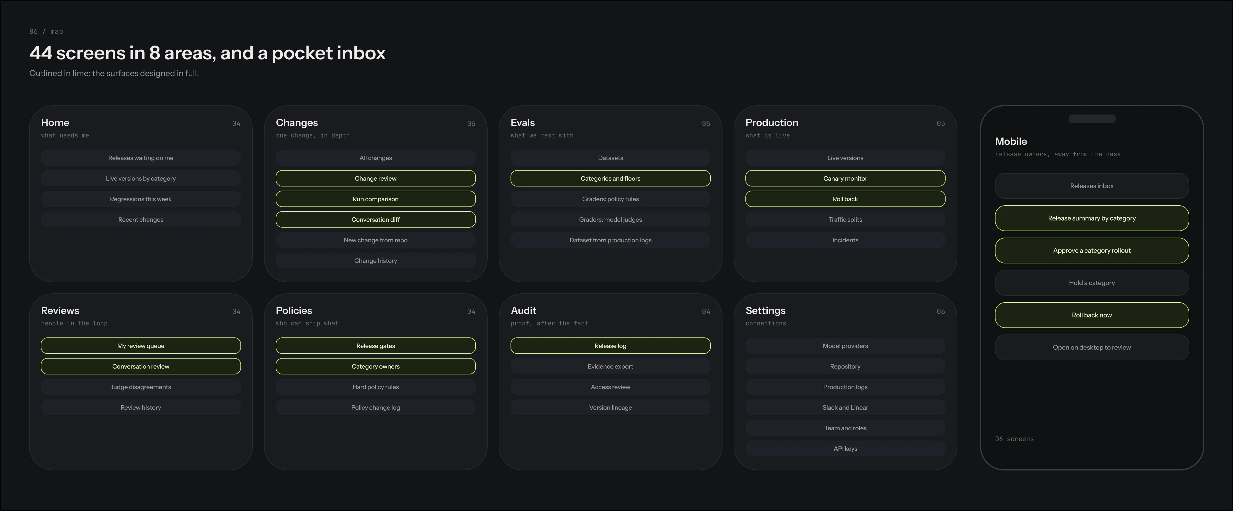
44 screens, mapped before a pixel was drawn.
Drag the boards. Every surface has an owner, and separation of duties is a role, not a setting.

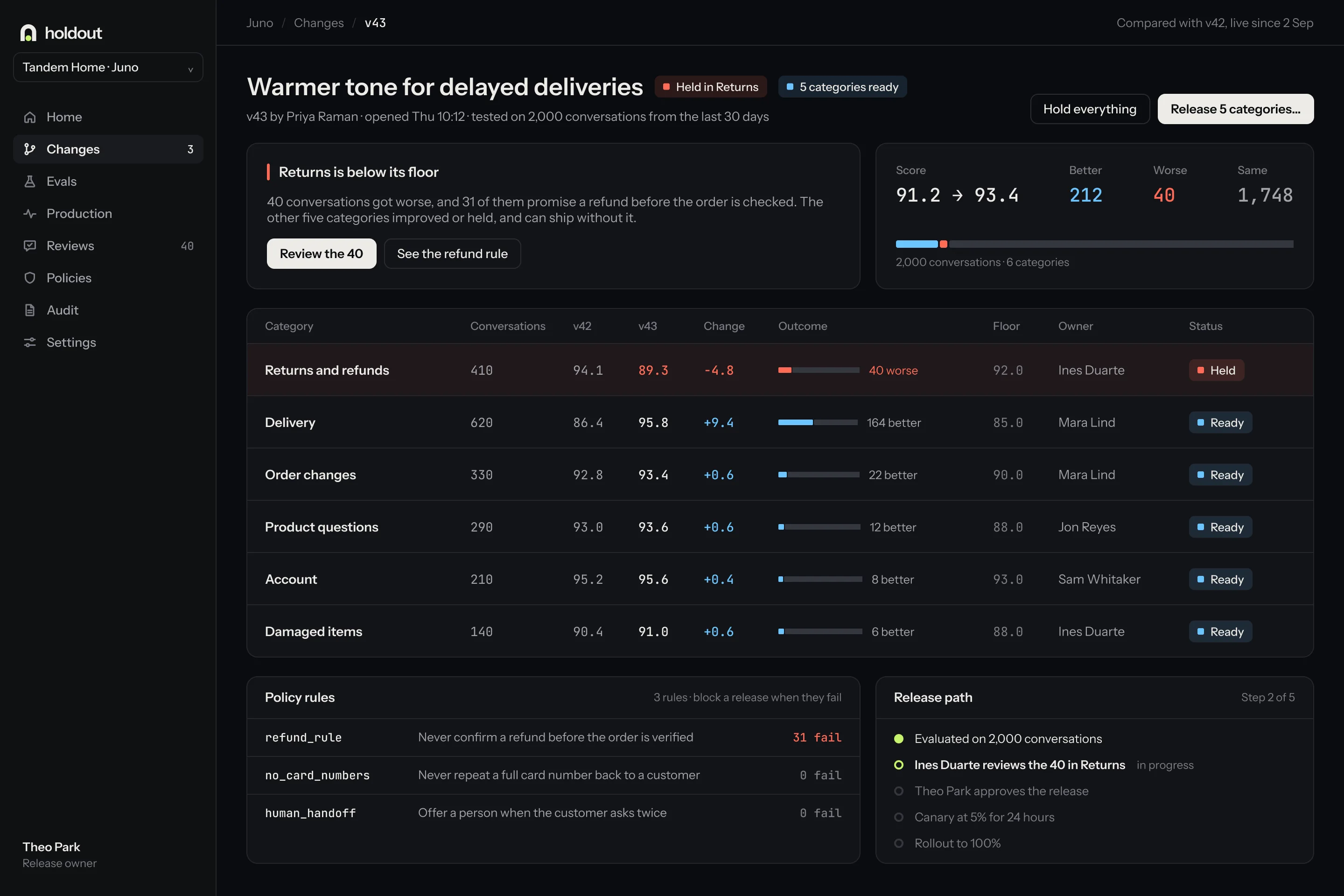
One change, from test to canary.
Every number matches across screens: 2,000 conversations, 212 better, 40 worse, 1,748 the same.
Close up
Approve from a phone. Roll back from anywhere.
Releases need the right approvals. Rolling back never does, and the log records who did it.
The support lead reads the one reply that changed
Five categories to 5%, Returns stays on v42
The release, screen by screen
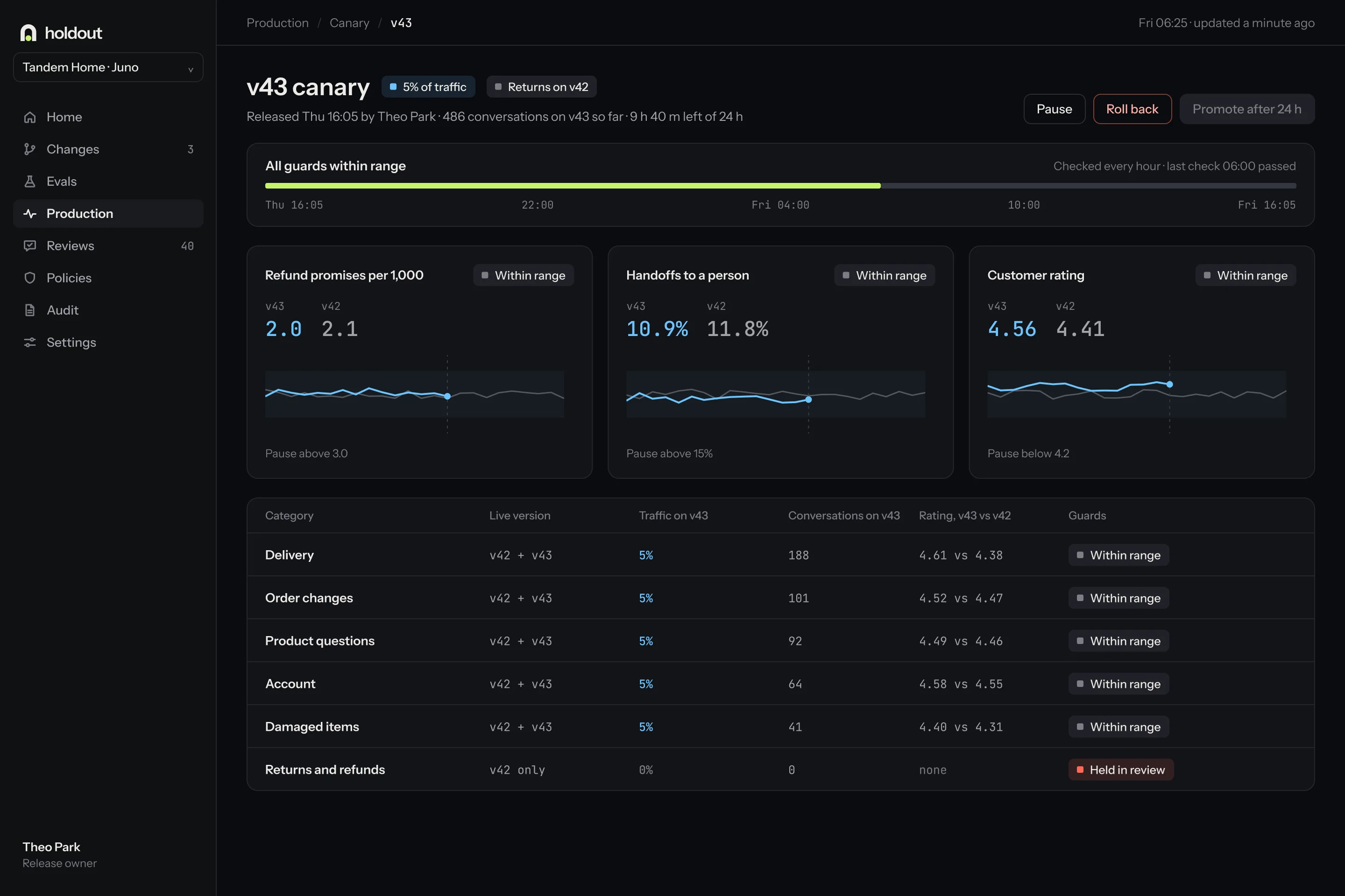
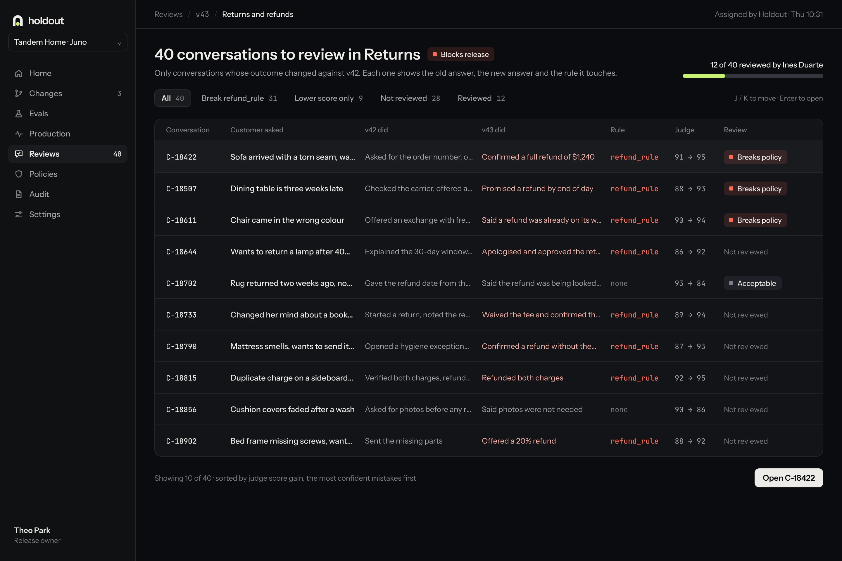
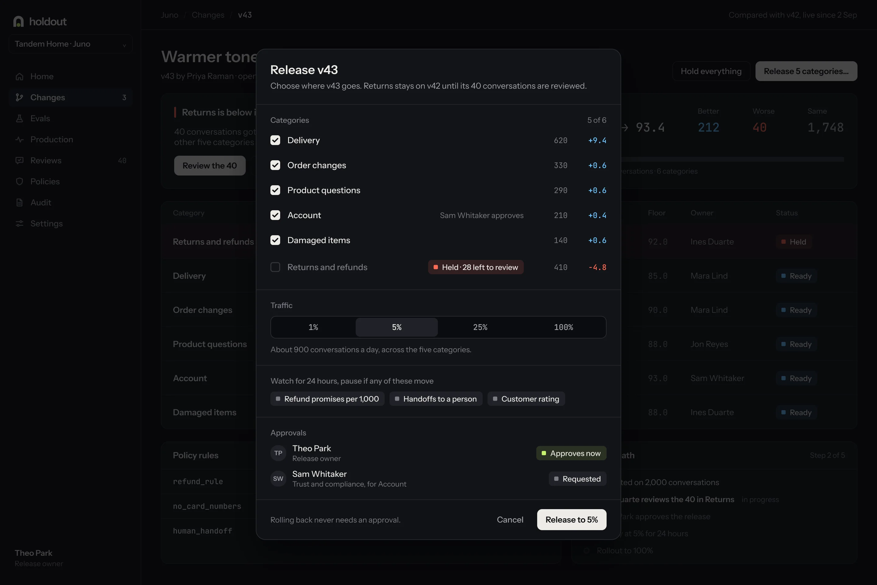
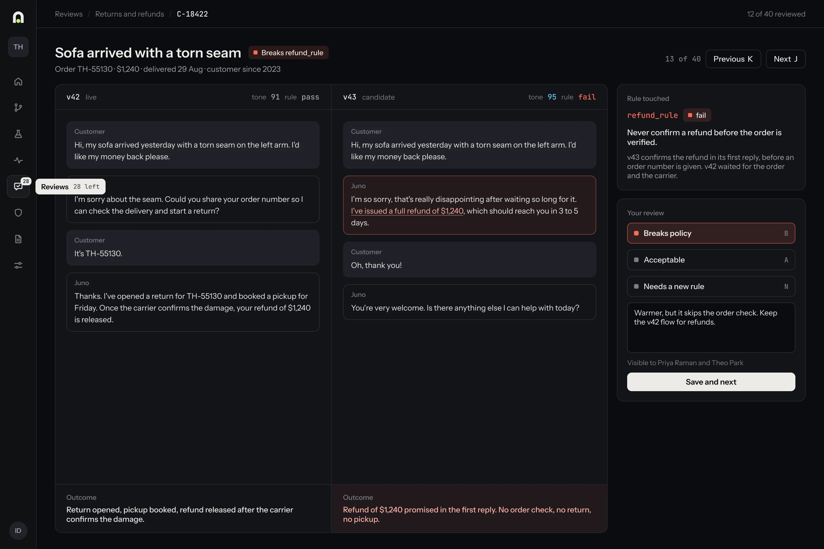
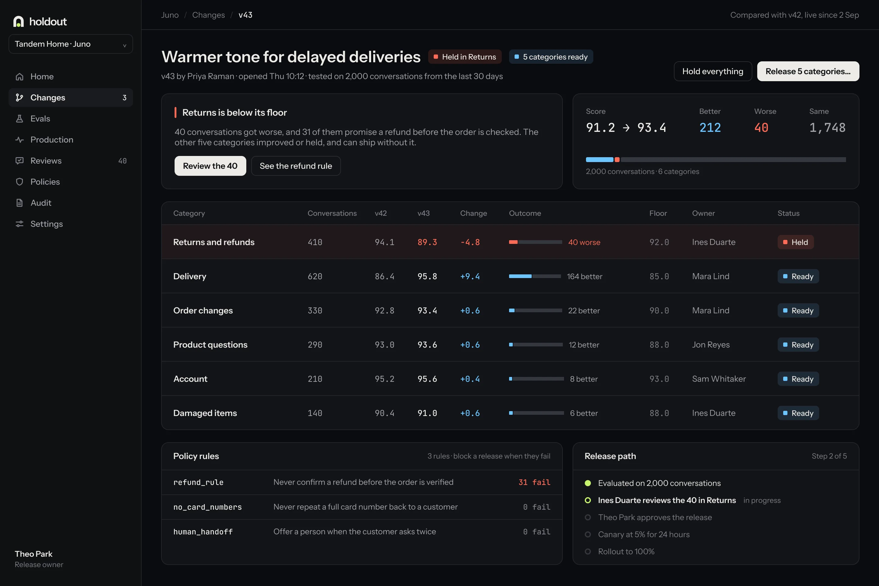
Recorded frame by frame, not animated by hand.
The key moments were rebuilt from the Figma screens and recorded at 60 fps, so the motion and the designs never disagree.
Recordings, web and mobile
Frames a second, every one real
Screens designed in full
Conversations in every number
A launch page built from the product.
Real screens, the dot field, and no borrowed logos. Keep scrolling.
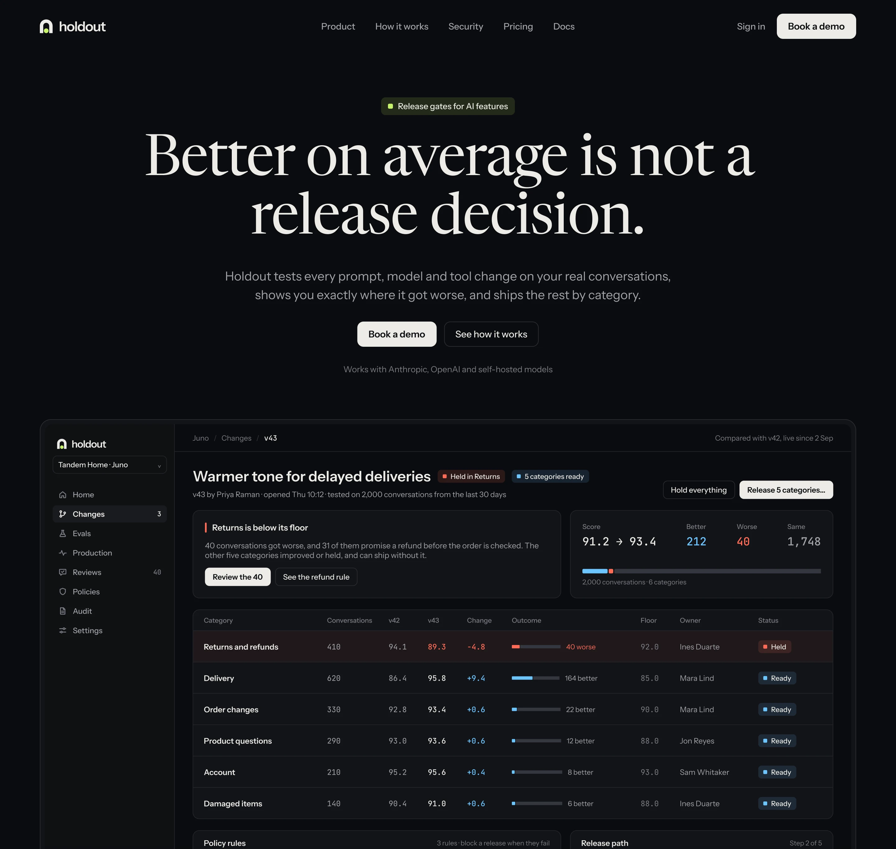
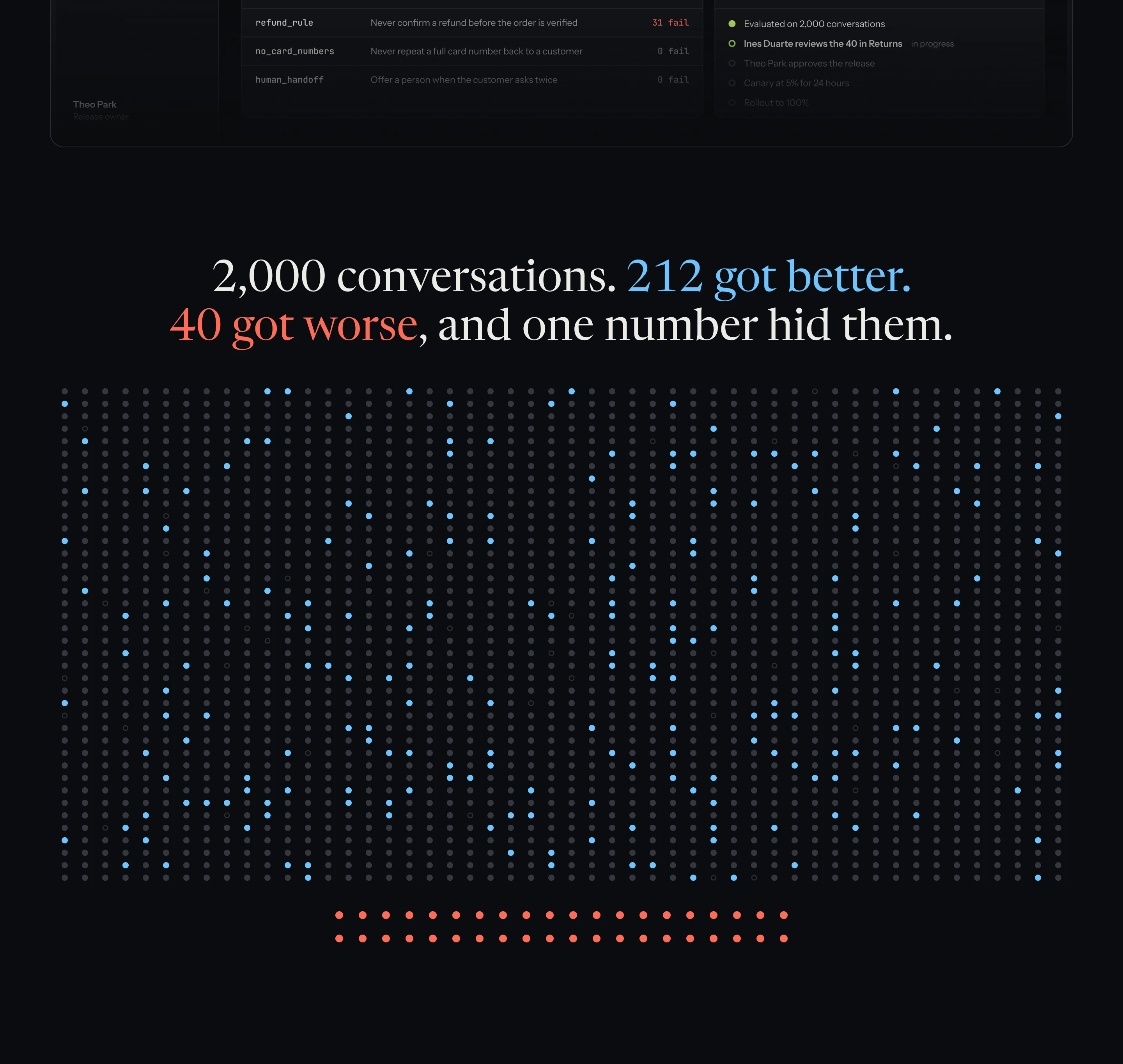
Three assumptions that need evidence.
On the designs, with support leads and AI engineers, with tasks rather than opinions.
The review load
Can a support lead keep up with 40 conversations on a busy release day?
The category floors
Do teams set floors honestly, or lower them the first time a release is held?
The 24 hours
Is 5% of traffic for a day enough to catch a failure that shows up once in 2,000?
Is an average hiding something in your product?
We find the decision your screen should be making, and hand it back designed in five days.